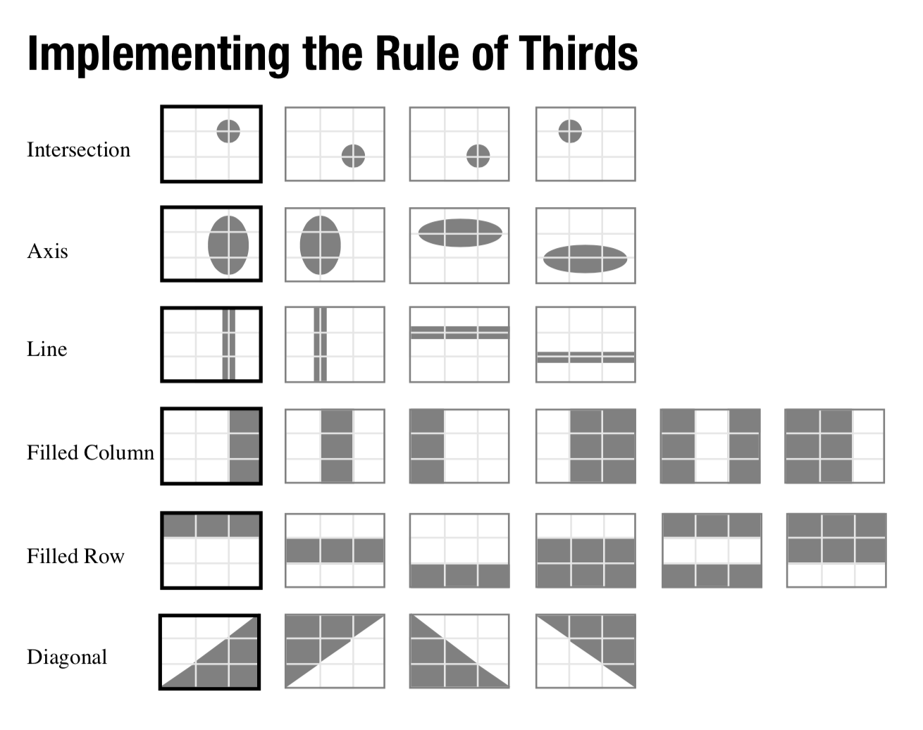
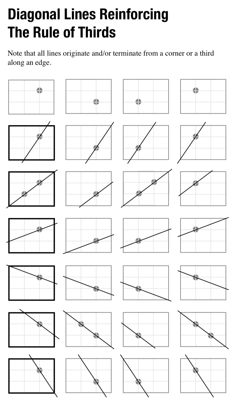
ELEMENTS:
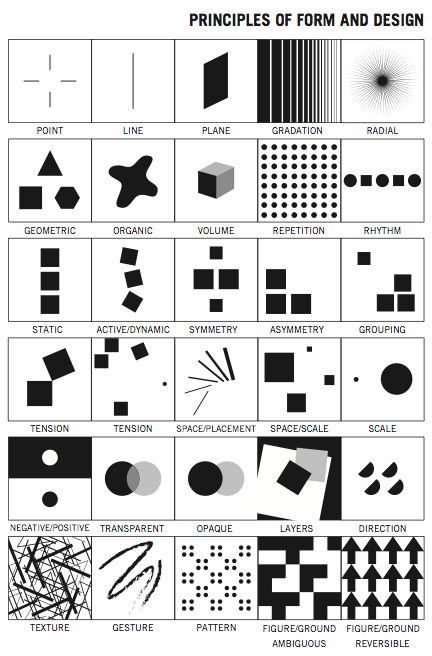
| Line | A line is the path of a point, or the connection between two points. Lines can be made on their own, or they can be created where two shapes meet. There is also “implied line,” where a line doesn’t really exist, but appears to be present. The way we treat our lines establishes a particular/dominant mood or emotion. |
| Shape / Space | Shape is a perceivable area (think silhouette). Shapes can be created by lines or by color or value changes that define edges. The shape itself is the positive space, and the space around the shape is the negative space. |
| Value / Tone | Value or tone is the relative lightness or darkness of an area. |
| Texture | Texture is the perceived look, feel, or quality of a surface. Texture can be actual or implied. |
| Color | Human perception of different wavelengths of visible light; Component parts include hue (the name of the color; example: blue), saturation (purity or intensity of the color), value (relative lightness or darkness of the color). [NOTE: we won’t use color in Beginning Drawing.] |
PRINCIPLES:
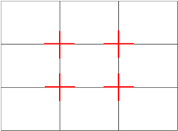
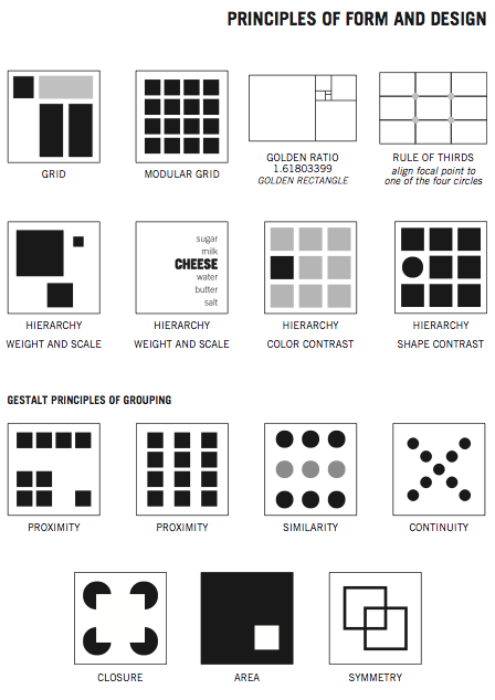
| Balance | Balance is the equalizing of the visual weight of elements. There are three types of balance: symmetrical (one half mirrors the other), asymmetrical (dissimilar items balance each other out), and radial (elements are spread out from a central point.
Symmetrical = dividing a composition into two equal halves with seemingly identical elements on each side. |
| Repetition / Rhythm | Repetition is a repeating visual element (line, shape, pattern, texture, movement), and rhythm is its flowing and regular occurrence. A subcategory of repetition is pattern. 
|
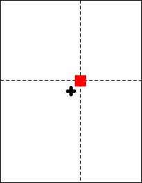
| Focus / Emphasis | The focus or emphasis is the object or element which first catches our attention.
|
| Unity / Harmony | Unity or harmony is the visually satisfying effect of combining similar, related elements. |
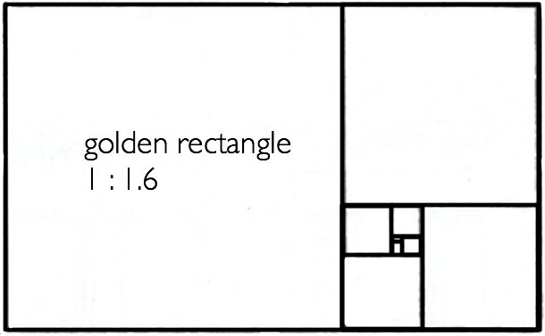
| Scale / Proportion | Scale is the overall size of something. Proportion is the relative size of objects within a work. For example, a caricature exaggerates the proportion of one or more facial features.
|
| Contrast | Contrast is the relative difference between elements. Bright vs Dark. Heavy vs Light, Rough vs Soft, etc. The greater the difference between light and dark areas, the more attention the area attracts.
|
| Movement / Hierarchy | Movement is the visual path our eye follows. Hierarchy is a manipulation of elements to create movement through a work. |
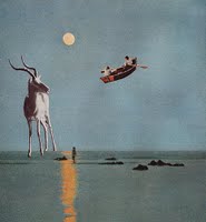
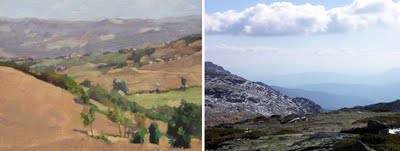
- Depth – overlapping forms suggest depth; changes in scale can suggest depth; illusionistic perspective can suggest depth, atmospheric perspective (see images here) can suggest depth

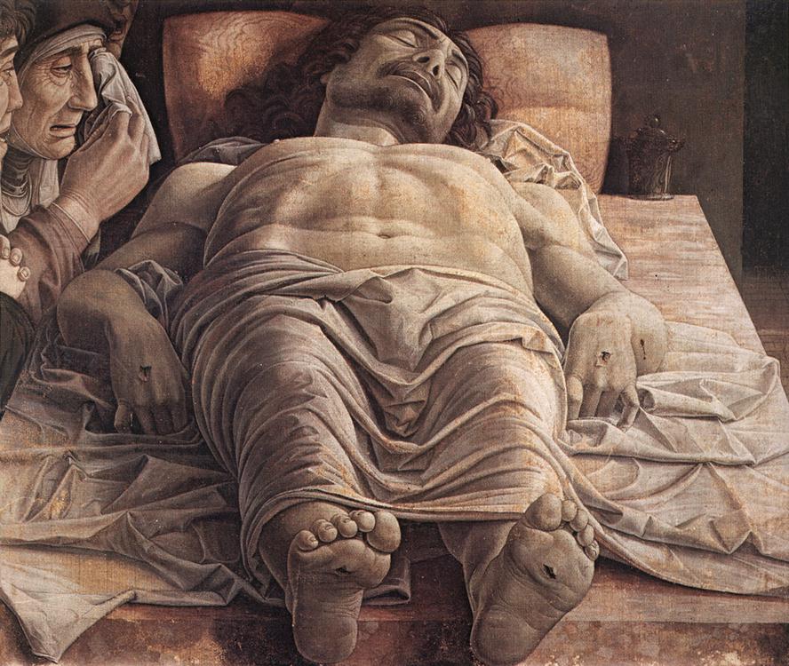
foreshortening also shows depth
OTHER IMPORTANT DEFINITIONS
-
Picture plane – the size and shape of your paper/drawing surface.
-
Closed composition – forms seem well contained by the edges of the picture plane
-
Open composition – the imagery appears unrelated to the size/shape of the paper, creating an impression of extending beyond the picture plane
-
Gestalt – “The sum of the whole is greater than its parts” is the idea behind the principle of gestalt. It’s the perception of a composition as a whole. While each of the individual parts have meaning on their own, taken together, the meaning may change. Our perception of the piece is based on our understanding of all the bits and pieces working in unison.
-
Positive and Negative Space –
- Point of view – the position from which the composition is seen by the artist (eye level and distance from the subject)
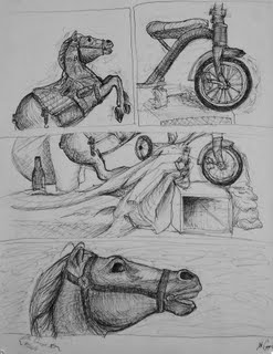
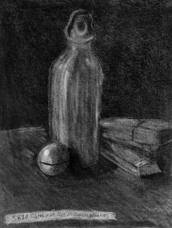
Composition exercise in class by John Ciampoli

Link to PDF of the above Principles of Design