Credit: http://blog.ted.com/10-tips-for-better-slide-decks/
Aaron Weyenberg is the master of slide decks. Our UX Lead creates Keynote presentations that are both slick and charming—the kind that pull you in and keep you captivated, but in an understated way that helps you focus on what’s actually being said. He does this for his own presentations and for lots of other folks in the office. Yes, his coworkers ask him to design their slides, because he’s just that good.
We asked Aaron to bottle his Keynote mojo so that others could benefit from it. Here, 10 tips for making an effective slide deck, split into two parts: the big, overarching goals, and the little tips and tricks that make your presentation sing.

The big picture…
- Think about your slides last. Building your slides should be the tail end of developing your presentation. Think about your main message, structure its supporting points, practice it and time it—and then start thinking about your slides. The presentation needs to stand on its own; the slides are just something you layer over it to enhance the listener experience. Too often, I see slide decks that feel more like presenter notes, but I think it’s far more effective when the slides are for the audience to give them a visual experience that adds to the words.
. - Create a consistent look and feel. In a good slide deck, each slide feels like part of the same story. That means using the same or related typography, colors and imagery across all your slides. Using pre-built master slides can be a good way to do that, but it can feel restrictive and lead to me-too decks. I like to create a few slides to hold sample graphic elements and type, then copy what I need from those slides as I go.
. - Think about topic transitions. It can be easy to go too far in the direction of consistency, though. You don’t want each slide to look exactly the same. I like to create one style for the slides that are the meat of what I’m saying, and then another style for the transitions between topics. For example, if my general slides have a dark background with light text, I’ll try transition slides that have a light background with dark text. That way they feel like part of the same family, but the presentation has texture—and the audience gets a visual cue that we’re moving onto a new topic.
. - With text, less is almost always more. One thing to avoid—slides with a lot of text, especially if it’s a repeat of what you’re saying out loud. It’s like if you give a paper handout in a meeting—everyone’s head goes down and they read, rather than staying heads-up and listening. If there are a lot of words on your slide, you’re asking your audience to split their attention between what they’re reading and what they’re hearing. That’s really hard for a brain to do, and it compromises the effectiveness of both your slide text and your spoken words. If you can’t avoid having text-y slides, try to progressively reveal text (like unveiling bullet points one by one) as you need it.
. - Use photos that enhance meaning. I love using simple, punchy photos in presentations, because they help what you’re saying resonate in your audience’s mind without pulling their attention from your spoken words. Look for photos that (1) speak strongly to the concept you’re talking about and (2) aren’t compositionally complex. Your photo could be a metaphor or something more literal, but it should be clear why the audience is looking at it, and why it’s paired with what you’re saying. For example, I recently used the image above—a photo of a container ship about to tip over (it eventually sank)—to lead off a co-worker’s deck about failure preparation. And below is another example of a photo I used in a deck to talk about the launch of the new TED.com. The point I was making was that a launch isn’t the end of a project—it’s the beginning of something new. We’ll learn, adapt, change and grow.

And now some tactical tips…
- Go easy on the effects and transitions. Keynote and Powerpoint come with a lot of effects and transitions. In my opinion, most of these don’t do much to enhance the audience experience. At worst, they subtly suggest that the content of your slides is so uninteresting that a page flip or droplet transition will snap the audience out of their lethargy. If you must use them, use the most subtle ones, and keep it consistent.
. - Use masking to direct attention in images. If you want to point something out in a photo, you could use a big arrow. Or you could do what I call a dupe-and-mask. I do this a lot when showing new page designs, particularly when I don’t want the audience to see the whole design until I’m finished talking about individual components of it. Here’s the original image.

Here’s the process for masking it. (1) Set the image transparency to something less than 100. (2) Duplicate that image so there is one directly over the top of the other. (3) Set the dup’d image transparency back to 100. and (4) Follow the technique here to mask the dup’d image. You’ll end up with something that looks like this.

You can use this technique to call out anything you want in a screenshot. A single word, a photo, a section of content—whatever you want your audience to focus on.
. - Try panning large images. Often, I want to show screen shot of an entire web page in my presentations. There’s a great Chrome extension to capture these—but these images are oftentimes much longer than the canvas size of the presentation. Rather than scaling the image to an illegible size, or cropping it, you can pan it vertically as you talk about it. In Keynote, this is done with a Move effect, which you can apply from an object’s action panel.
. - For video, don’t use autoplay. It’s super easy to insert video in Keynote and Powerpoint—you just drag a Quicktime file onto the slide. And when you advance the deck to the slide with the video that autoplays, sometimes it can take a moment for the machine to actually start playing it. So often I’ve seen presenters click again in an attempt to start the video during this delay, causing the deck to go to the next slide. Instead, set the video to click to play. That way you have more predictable control over the video start time, and even select a poster frame to show before starting.
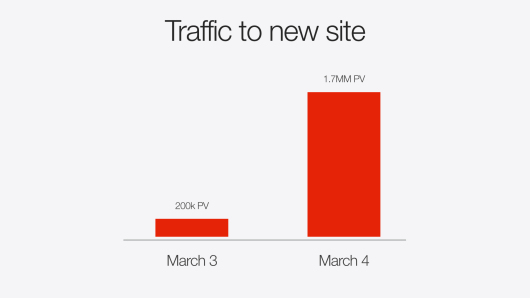
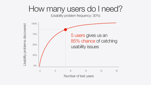
. - Reproduce simple charts and graphs. Dropping an image of a chart into a presentation is fine, but it almost always disrupts the feel of a deck in unsightly fashion. If the graph data is simple enough (and you have some extra time) there’s a way to make it much more easy on the eyes. You could redraw it in the native presentation application. That sounds like needless work, and it might be for your purposes, but it can really make your presentation feel consistent and thought-through, of one flavor from soup to nuts. You’ll have control over colors, typography, and more. Here are some examples.
.