Why are we doing this? (Objectives)
- Practice experimenting with composition and visual relationships
- Build vocabulary (principles and elements of design) through oral and written critiques
- Practice working with the strict limitations to encourage creative thinking/brainstorming
- Practice researching through a variety of approaches (watching films, notes, sketching, color experimentation)
- Practice mixing paint colors
- Practice technical craftsmanship skills through the creation of artworks (taping off borders, making straight lines, etc)
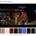
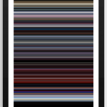
For this assignment, you will be analyzing the narrative arch of a film and translating it into specifically arranged pattern of stripes of various colors and proportions. This purpose of this study is to explore the degree to which color enhances or illustrates the narrative of a film. You will be assessing the role color plays in a particular film and how the use of color shifts (or doesn’t) through out.
Materials/Format
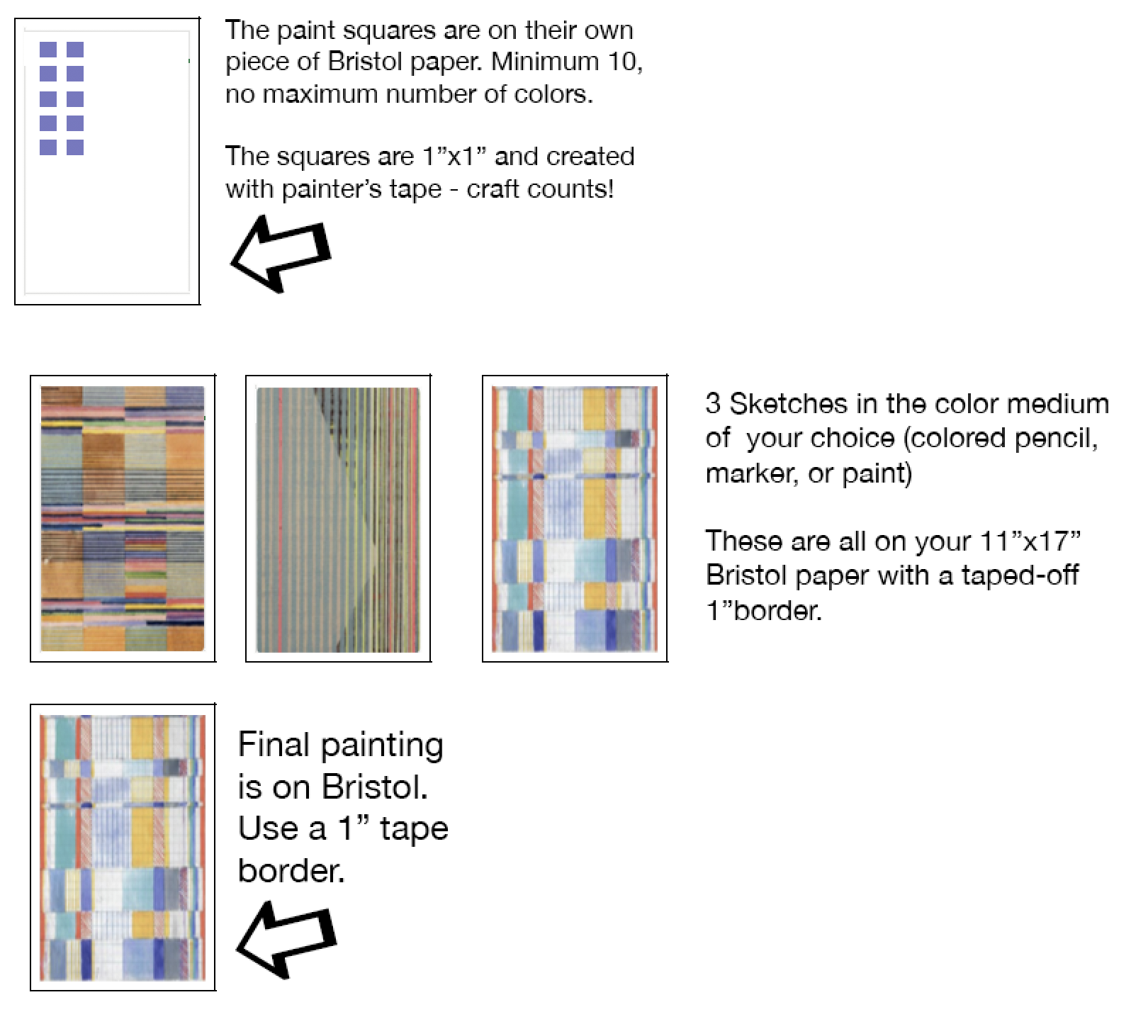
1 page of at least ten 1″ squares will be made on your bristol paper using guache paint.
3 preliminary sketches will be made on your Bristol paper (tape off a 1″ border around the entire paper). These studies can be drawn in color media of your choice (color pencil, marker, or even the guache if you want the practice) to map out placement of your colors.
For your final piece you will be working on Bristol board using the guache paint.
Process
- Watch this film
2. Select a film to analyze. Here are more film resources if you don’t want to select a film from the video above.
https://www.studiobinder.com/blog/how-to-use-color-in-film-50-examples-of-movie-color-palettes/
http://thecolorsofmotion.com/films
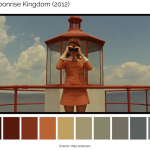
http://www.anothermag.com/art-photography/3586/wes-andersons-colour-palettes
https://digitalsynopsis.com/design/color-palettes-famous-movies/
http://moviesincolor.com/page/5
3. Analyze the film by making a list of the general colors (minimum 10 – it can be more) used and the order they are used in.
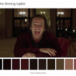
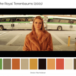
4. Then, using pencil/ruler/masking tape on watercolor paper, create 1”x1” squares for the colors. Then, using gouache, mix the colors and paint each square a different color from the film. Refer to the Wes Anderson color palette as an example.

http://www.anothermag.com/art-photography/3586/wes-andersons-colour-palettes
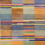
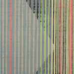
5. Develop 3 sketches/experimental compositions of STRIPES with these colors to inspire your 1 final piece. Take into consideration the narrative arc of the movie, any particular characters, any particular environments, specific actions/events, etc. Along with color, think about how the organization of stripes can inform your concept/what you are trying to convey about the film.
- Stripes can be long, short, vertical, horizontal, diagonal. You are encouraged to use a combination in order to develop patterns that reflect what you are analyzing.
- Width could be determined by what you are trying to covey (ex: thin for a short interlude or insignificance, wider for panoramic views, something heavy or oppressive, etc)
- Line quality is also a consideration. Lines can be rigid, more organic, or combination. Think about what best conveys your intent.
- Think about your color vocabulary- was there a color triad? Did the film use complementary colors or was it monochromatic? Is this something you can utilize in your stripe analysis?
If you need a refresher on color schemes and vocabulary, watch this short video:
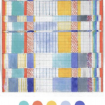
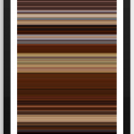
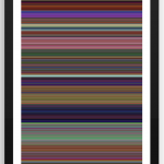
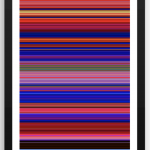
6. For your final piece, tape off a 1” boarder around the sides. Select one of your sketches to execute in paint. Transfer to final paper using pencil to start. Lightly place your lines as you do not want them to be evident. Color is the focus of the assignment. Again, think of your color definitions and how to best use color to convey your analysis. Think about Monochromatic, Saturation, Hue, Analogous, Value, Shade, Triadic, Tint, and Complementary. Think about overlapping of stripes to create more color and patterns. These intersections can create lots of diversity in your piece.


Grading
2pt – 1 page of one-inch squares / 3 rough compositions
2pts – followed directions/used class time wisely
2pts – explored variations/options (didn’t just go with first impulses)
3pts – ability to use, analyze, and critique elements/principles of design throughout
3pts – craft
8pts – reflection
David Batchelor – The Fear of Colour from HENI Talks on Vimeo.