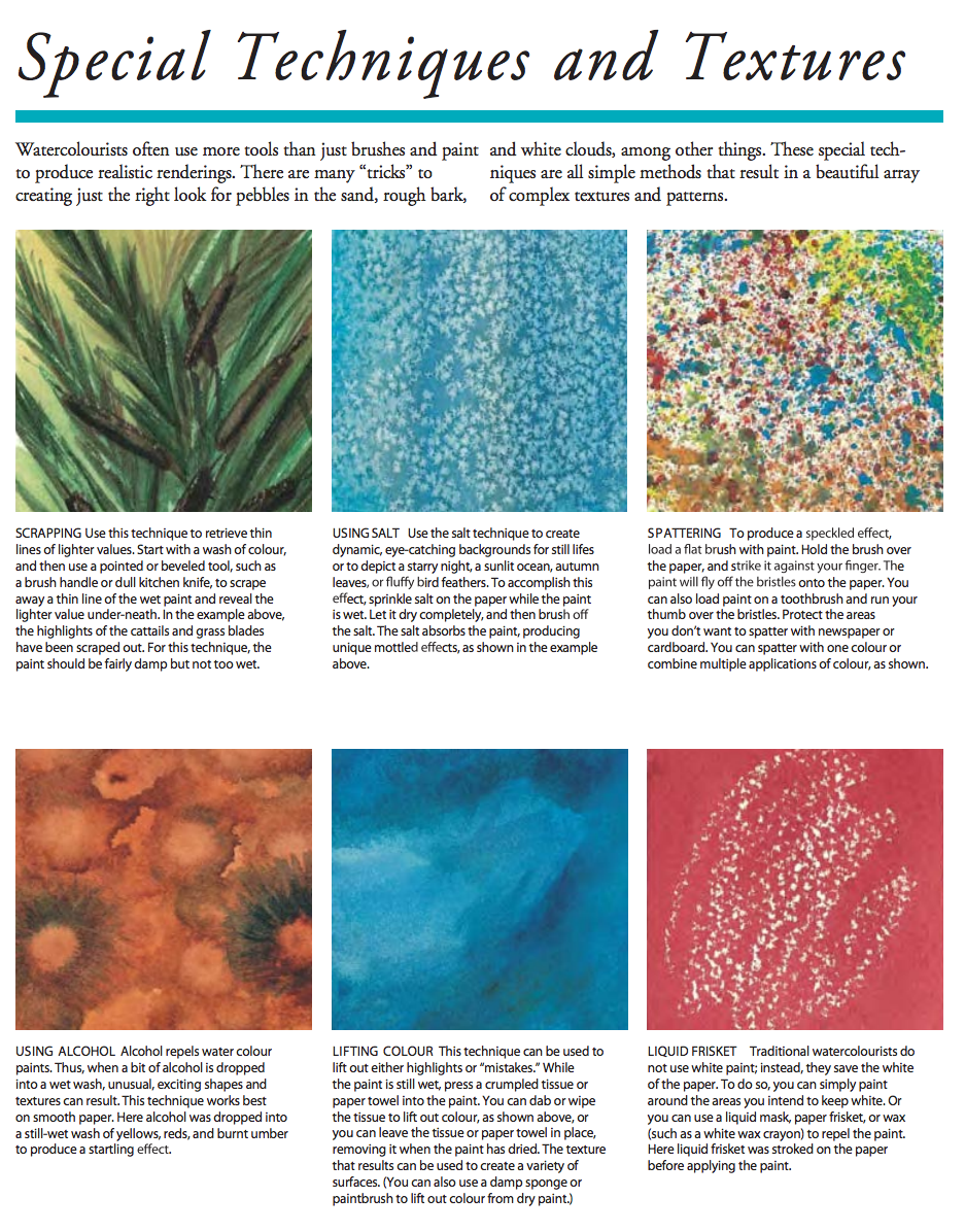
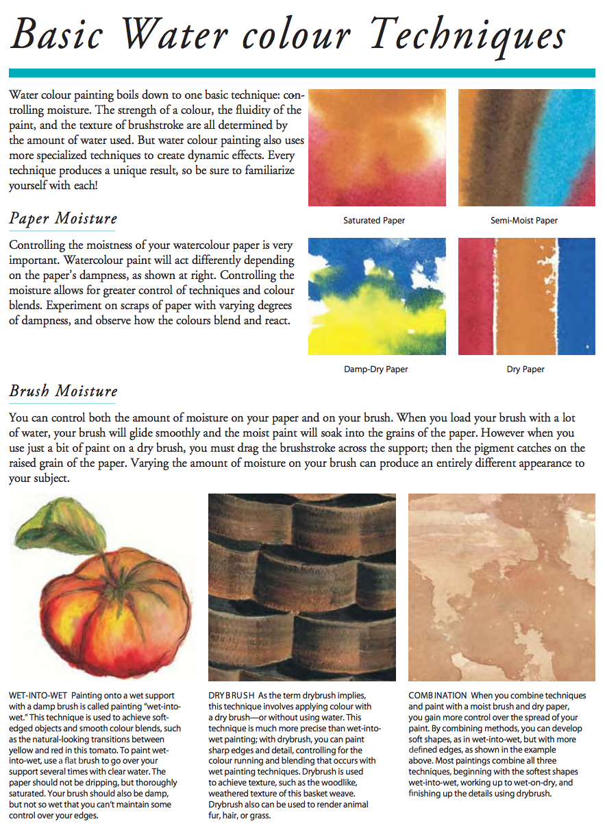
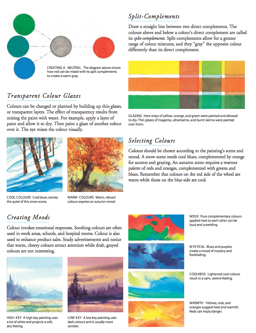
General watercolor guidelines (all these rules can be broken):
- Plan – work back to front
- paint light to dark
- To make darker shadow colors, use “red”+”green” or “red”+”blue” depending on coolness/warmth.
- first coat must be dry before you apply the next (hair dryer can be useful)
Mixing Various Skin Tones in Watercolor
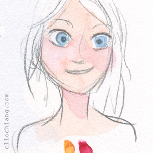
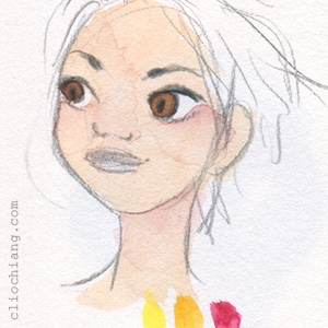
I don’t have these down to an exact science, but there are just a few colours I tend to use for skin tones with different ratios for each. I’ve tried to break it down according to how I think about them – I’ll first figure out whether the person is cool or warm-based. Cooler skintones have more blues in their undertone, and warmer have pink/yellow undertones, and there’s also the occasional neutral skin tone that almost reads as a green (sometimes found in olive-skin types). I always start with a very, VERY light wash of a colour, and this could be either a pale version of their final skintone or the undertone – usually a blue, yellow, or red. Afterwards I’ll start layering colours on top of that, to finally reach the darkness of colour I want. The colours used for the images below are lemon yellow (cool yellow), new gamboge (warmer yellow), quinacridone red (warmer red), quinacridone magenta (cool red), phthalo blue, and burnt umber in Daniel Smith watercolours. Sorry for the wonky face drawings, but here we go:
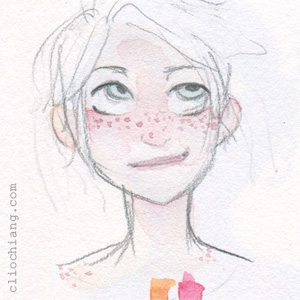
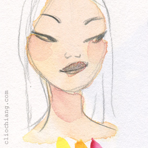
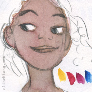
A very, very watered down mix for those who pretty much burn if they go out in the sun, new gamboge & quin. red. These types are very pale and tend to be bright pink-based. I’d say you could get away with the skin base being the white of the paper and just use straight-up watered down red for the very porcelain.
A darker version of above – starting to use more yellows in the mix. New gamboge & quin red. Still pink-based.
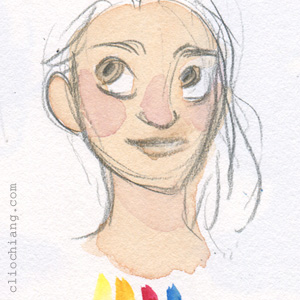
Starting to use more yellows here, with lemon yellow coming into the mix alongside new gamboge & quin red.
This is the same exact mix as above, except I layered down lemon yellow first, and then the mix of new gamboge and quin red on top of it later. It’s similar but reads more yellow.
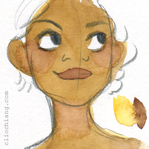
Getting into the more olive-skinned territory with the addition of phthalo blue.
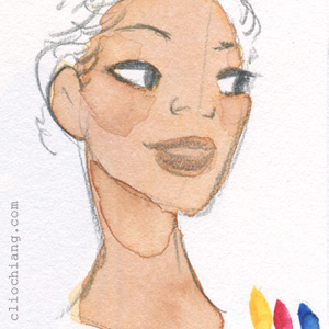
More blue, with new gamboge and quin red, and darker make a tanner skin tone.

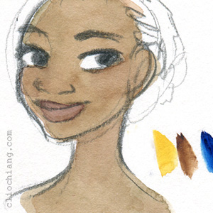
Started using burnt umber into the mix for a richer colour, leaning red here with new gamboge and quin red.
A darker almost brick-coloured skin tone, with new gamboge, quin red, phthalo blue, and quin magenta coming into the mix.
Reddish undertone with new gamboge, quin red & magenta, phthalo blue.
Gold-based undertone – this one’s just new gamboge and burnt umber.
More neutral undertone with new gamboge, burnt umber, and phthalo blue.
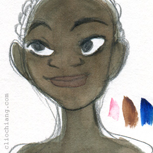
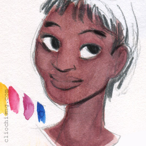
Dark skin with blue undertones – burnt umber and phthalo blue with the smallest smidge of quin magenta.
I’ll usually put a bit more saturation into the skin tone mix for blush and lips, and some blue into the shadows. Again, definitely start light and layer layer layer until you find the colours you like. Experiment with what you have and see what works for you. Hope this helps!
Credit: http://blog.cliochiang.com/post/86723370634